
Creating Vancouver’s next flag
Finalists selected
The Vancouver Flag Committee has selected six finalist designs from the 138 public designs submitted. The designs reflect a wide range of creative interpretations of Vancouver’s identity.
The committee evaluated each submission based on the design brief and the principles of flag design outlined in Good Flag, Bad Flag. To ensure a fair and impartial selection process, all entries were reviewed anonymously, without identifying information. As part of the evaluation, the committee consulted with members of the North American Vexillological Society to refine designs in alignment with established flag standards, including adjustments to color for visibility on a flagpole and considerations for accessibility. During the review, judges independently created two composite flags by combining elements from multiple submissions they felt worked well together. The original creators whose designs inspired these composites were credited for their contributions.
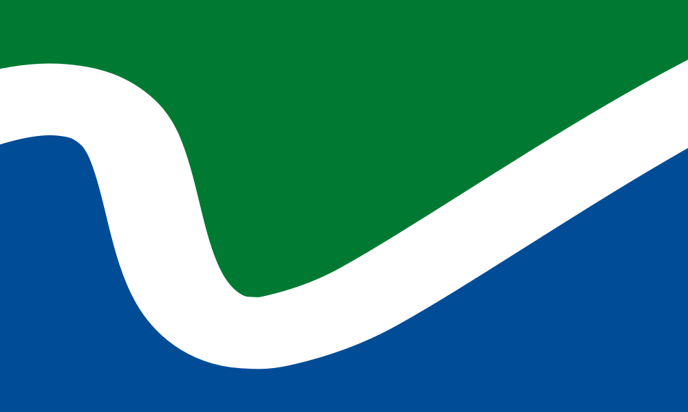
Flag #1 – Brooke Nugent
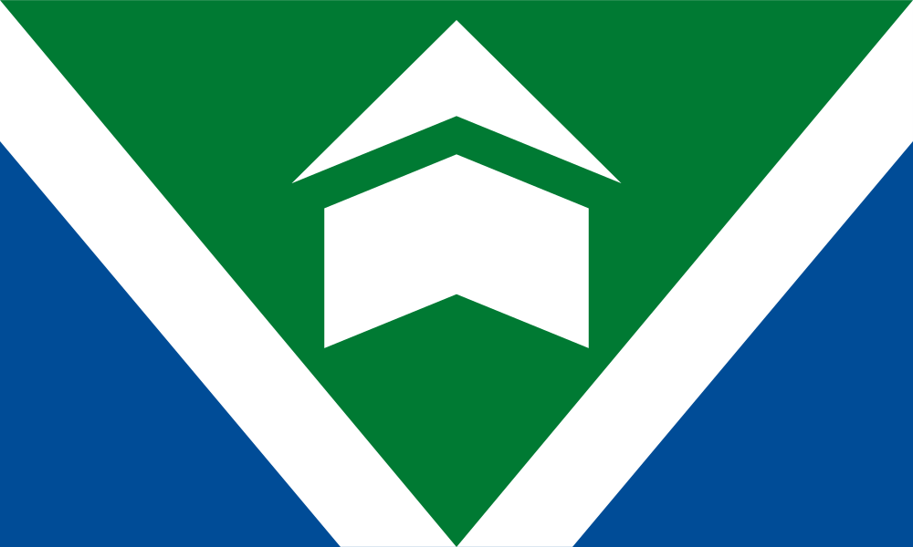
As I designed this flag, I took care to ensure it followed the Five Principles of Good Flag Design. While it is a simple design on the surface—easy to remember and draw from memory—I put a great deal of thought into every element. Each color, each angle, each shape has a purpose. For the colors, I chose to stick with a PNW palette—a nod to honor the current flag that has represented Vancouver for the past 30+ years. The blue represents the Columbia River, which played a key role in Vancouver’s beginnings, and continues to serve the region and provides a beautiful backdrop to the waterfront and the growth that’s come with it. The blue and white also represent the mountains that surround us. The green represents the city’s lush forests, wetlands, and parks, and its eco-friendly and climate-conscious efforts to preserve the environment.
As for the symbolism, the main elements you’ll see are the white “V” shape and the object. The most obvious reason for the white “V” is to represent Vancouver but I also included it to symbolize the fence around Fort Vancouver, the city’s dedication to improving and maintaining streets throughout Vancouver, such as with the Main Street Promise project, and endless new paths toward growth, hence why they are angled up and outward. The object symbolizes the city’s history and beginning: Fort Vancouver. However, I kept it abstract enough so that it may also be interpreted to look like the Salmon Run Bell Tower—an iconic structure in Esther Short Park. Furthermore, the shape may also be interpreted as an arrow pointing upwards, to again symbolize the city’s continued growth.
Flag #2 – Jacob Strain
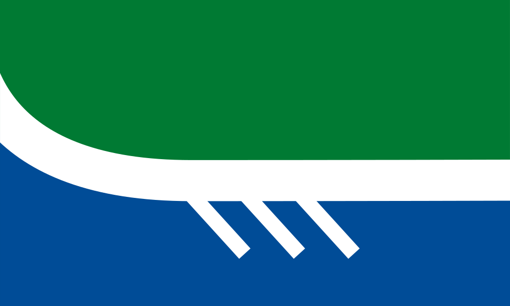
My flag represents the unique geological, cultural, and societal traits that make Vancouver distinct. The blue represents the Columbia River and its relative location to the city. The green represents the lush nature that surrounds us. The white middle line represents our highways that connect our city. The three diagonal lines represent the paddles of a canoe in water, acknowledging the three Native American Tribes that once inhabited the area: Chinook, Klickitat, and Cowlitz. Lastly, the two center lines that eventually curve upward represent the future of our city as we move upward into a new, bright era. The design is more minimalistic, in the hopes that it will appeal to a larger audience and can be used as a symbol for people to use as a badge of honor that they live in Vancouver.
Flag #3 – Nathan Hunter
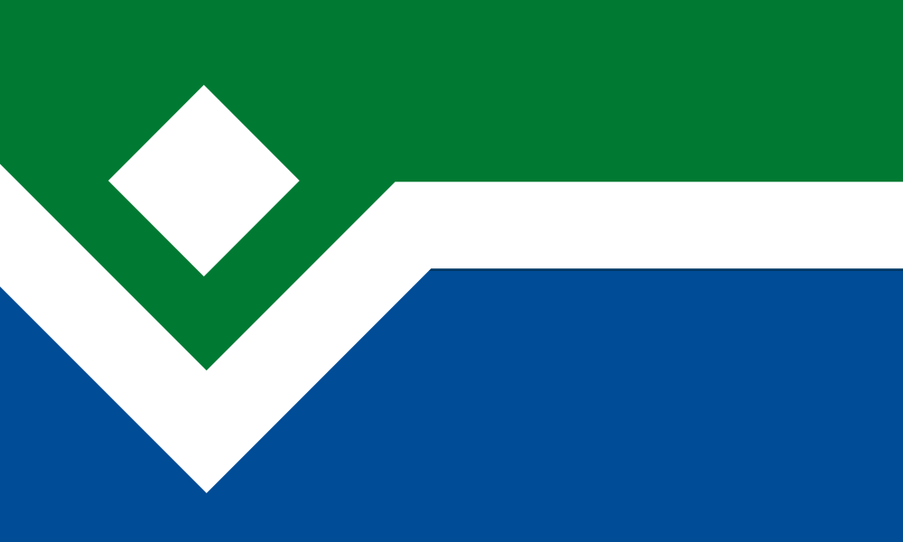
When designing my submission, I had two design goals. Firstly, I wanted to emphasize continuity from Vancouver’s storied past to our hopes and aspirations for her future. Secondly, I wanted to balance showing unity with our region and country, while at the same time establishing a distinct Vancouverite identity. To achieve the first goal, I started with the Fort logo for Vancouver that you still find on some of our older signage. I’ve always thought that this was a bold, recognizable shape, and I’ve always appreciated the subtle ‘V’. I wanted to honor the strength of the design and our history as a town that grew around the fort, but I did not want to send the message that Vancouver wants to keep people out. By simplifying the shape, I hoped that it could still read as the fort but also read as the gem of a city being cradled protectively in a hand. Thus, we draw a line of continuity from where we’ve been to where we are going. In order to balance unity and distinctiveness, I focused on colors and overall shapes. Many flags in the Pacific Northwest take their color cues from the Cascadian flag and follow a green/white/blue color scheme, where the choices, what your flag symbolizes, green stands for our forests, the blue for our rivers, and the white for our mountains. I stuck to this tradition, but to put a specific Vancouverite spin on it, I used a specific green and blue from the palette provided (this was also part of the design brief). To show unity with the nation, I used a format common throughout America, where there is an emblem on the hoist side and horizontal stripes on the fly side. However, I also felt that it was vitally important to show distinctiveness from our neighbor to the south. So, whereas the Portland flag’s most distinctive elements draw on smooth curved shapes, I made my submission use a more angular design. Finally, as a bonus, this flag is open to a geographic interpretation. You can read the green part as representing the state of Washington, the blue part as The Columbia, and the white elements as Esther Short Park and The Waterfront. This highlights Vancouver’s role as the gateway to those visiting western Washington from the south. We are, after all, still built around a fort. But I hope that it is a fort whose gates will remain forever open in welcome.
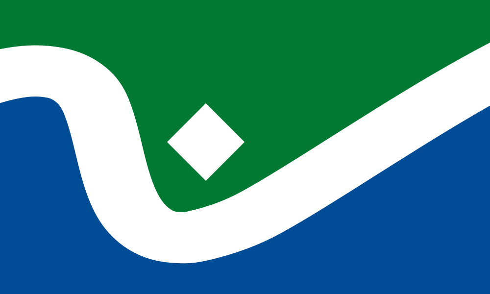
Flag #4 – Composite, Brooke Nugent and Nathan Hunter
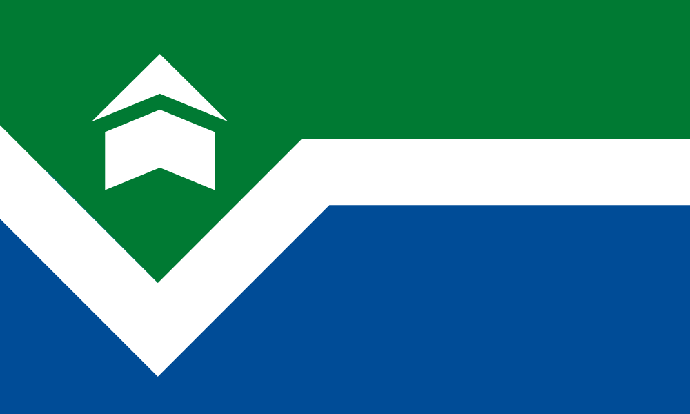
This design incorporates elements from two entries, as suggested by the Flag Design Committee. This geographic flag features an element that could represent multiple iconic places in Vancouver, including Fort Vancouver and the Salmon Run Bell Tower in Esther Short Park.
Flag #5 – Brian Richards
This proposed flag for the City of Vancouver, Washington, is a heartfelt tribute to the soul of our city, stitched with stories of those who came before us, and ready to weave those still yet to be told. Bold and modern in shape, yet timeless in spirit, the flag embraces the enduring theme of this place, along the river. It speaks not only to geography, but to destiny – to why people have always gathered here, where the water bends, time flows, and life finds its rhythm. At its heart, a stylized blue ribbon winds through the flag like the mighty Columbia River, shaping our border and arching into a graceful “V” for Vancouver. Just as the river knows no pause, neither does our humble city. It grows, adapts, and always keeps moving forward. To the north, the Grant Street Pier stretches from the shoreline, symbolizing our city’s renaissance. Like an outstretched hand over the water, it bridges our present with the promise of tomorrow. The flag features three meaningful colors, each representing a core part of Vancouver’s identity: Fir Green, echoing the forests of Washington and the state flag, honors our evergreen resilience and our bond with nature. Navy Blue, from Oregon’s flag, salutes our neighbors across the river and our shared regional spirit of the Cascades. River Blue flows through the center, illustrating the Columbia, our awe-inspiring ecological and commercial lifeline. The number three carries powerful symbolism throughout: Three founding cultures: the Indigenous Cowlitz, Chinook, and Klickitat peoples; the British of the Hudson’s Bay Company; and the American pioneers like Amos and Esther Short. Each brought purpose, resilience, and a story to this land. Three peaks—Mount Hood, Mount St. Helens, and Mount Adams – frame our sky, their silent strength reminding us of nature’s beauty and power. Three points in the “V” of Vancouver represent our community today – where we raise families, build dreams, and shape a future rooted in justice, inclusivity, and shared purpose. But above all, it is the river that gives this flag and our city its soul. More than a boundary, it is a bearer of memory and motion. Its waters carved this land long before us and will carry its stories long after we’re gone. The river mirrors our lives, sometimes drifting easily, other times a rushing current, through challenge and triumph, across seasons of change, but always forging ahead. To stand on its banks at dusk, sky blushing and moon rising, is to feel a part of something eternal. The river doesn’t ask who we are; it simply flows and sometimes carries us. It shapes the land as it shapes our character – quietly, steadily, and gracefully. This flag is a reflection of who we are: a city forged by history, driven by hope, and united by our community, together, along the river.
Flag #6 – Composite, Brian Richards and Nathan Hunter
This design incorporates elements from two entries as suggested by the Flag Design Committee. This geographic flag places Vancouver and the Fort along a stylized path of the Columbia River.
Thank you for your feedback
Thank you to the more than 1,500 community members who shared feedback on the finalist designs this fall. The survey closed Oct. 10 and your feedback helped inform the committee’s final recommendation to City Council.
Overview
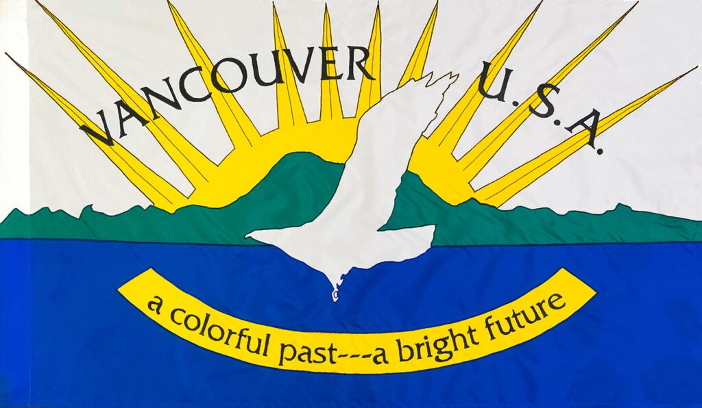
Vancouver has grown and changed since its flag was created in 1993. The current flag is dated, not easily recognizable, and doesn’t follow basic flag design principles. In early 2025, the City announced a design competition to create a new City flag that would represent the community’s shared values and aspirations.
Flag Design Review Committee
The Vancouver City Council appointed a Flag Design Review Committee. The Committee is comprised of Vancouver residents and two members of City Council.
The Committee will review the 138 entries and make recommendations for finalists. After the finalists have been selected, residents will be invited to provide feedback on their preferred designs. The Committee will use that information to inform their final design selection and a runner-up. The recommended design will be submitted to the City Council for final adoption. The committee reserves the right not to recommend a proposed flag if a suitable design is not submitted.
Committee members
- Rosalinda Mendoza, Chair
- Hèctor Alejandro Varela-Betancourt, Vice Chair
- Mayor Anne McEnerny-Ogle
- Councilor Ty Stober
- Naomi Axlelrod
- Russell Ford
- Lee Rafferty
Committee meetings
- June 20, agenda | minutes
- July 24, agenda | minutes
- September 4, agenda | minutes
- October 25, agenda | minutes
Flag background
Vancouver’s first flag was adopted by the Vancouver City Council in 1993. It was designed internally with limited public engagement and has remained the City flag for 30+ years. As described in the 1993 Staff Report, the current flag design represents Vancouver’s “emergence as a “world-class city and its strength and natural beauty.” The City is seeking to create a flag that uses flag design best practices and is a recognizable symbol of Vancouver.
Design competition
The City invited the public to submit flag designs between March 24 and June 14 (Flag Day). Entries were required to follow a design brief to ensure the flags represent the community and meet basic flag design standards.
Design brief
According to Good Flag, Bad Flag: How to Design a Great Flag,” published by the North American Vexillological Association, a flag should be created following basic design principles. The Design Review Committee’s decision will be informed by the criteria outlined in this publication and additional design concepts. The requirements are as follows:
- Have enduring appeal that reflects the City, community values, diversity, and future aspirations.
- Use two or three basic colors that follow WCAG contrast standards for accessibility from the City’s color palette. Follow the instructions on how the primary and secondary colors work together.
- Simple design: no lettering, numbers, seals or logos.
- Be distinctive or related. The design should represent a cohesive theme with related components that connect with the City. Avoid duplicating other flags, but you may use similarities to show connections.
- The design should be easily understood when flown outside on a flagpole or displayed indoors beside the state and United States flags.
- Consider different uses. The flag will typically be 3 ft. x 5 ft. but may be reproduced in other sizes depending on its use on other products such as stickers, hats, pins, etc.
Designs will be disqualified if they:
- Are generated by Artificial Intelligence (AI)
- Contain religious symbols, depictions of violence, nudity, profanity, or political images or themes
- Interpreted as discriminatory, hateful or defamatory
- Reference alcohol, drugs, or illegal activities
- Submitted after the deadline
Prizes
- Credit for design in City communications channels
- Flag raising ceremony at a date to be determined
- Key to the City
- City flag
- Monetary prize